UX Case Study: CNN Website Redesign
Designing for a Millennial Audience
Background
CNN’s brief asks us to revamp their desktop website to suit a Millennial audience. They are encountering the following problem:
“Millennial readers feel disconnected from CNN’s desktop website since it doesn’t cater to the way they share and consume content.”
Scoping Framework
This problem space brings up some key assumptions that I’m looking to validate with research:
That Millennials consume news from online sources rather than traditional channels.
That Millennials primarily get their news from social media, preferring to use mobile over desktop.
Research Objectives
With my research I wanted to understand:
How Millennials share and consume news content as well as the needs, motivations & frustrations that come with this.
Affinity Map
My surveys, interviews, contextual inquiry and competitor analysis came to the following key findings:
News is generally consumed passively, unless actively seeking information.
Reliable factual information is the main criteria for news.
Shareability comes with providing content that is relevant to the user.
Both previous assumptions were validated.
Personas/ Archetypes
I’m working with two main personas: The News Junkie and the Casual Reader. In the right scenario, both personas embody the Archetype of being actively engaged when seeking information.
These would later inform my design principles.
Customer Journey Map
Millennials mainly get their news from Facebook, with triggers, news content and sharing being native to the platform. Google is mainly used as a tool to verify the news they come across on Facebook or YouTube.
Users enter news websites via a social media link or directly from a Google search. Users share news content on Facebook, Facebook Messenger, WhatsApp or via text message.
News content that is false, biased or sensationalised cause the biggest frustrations, along with important information not being stated upfront. The user is also unlikely to share news content if it’s not relevant to them.
There are opportunities for CNN to counter these problems.
Design Principles
These design principles put facts first, presents news relevant to the user, and makes accessing and sharing information easy.
MVP Matrix
The features of Phase 1 help establish CNN as a trustworthy news source, makes information easy to find, presents the user with relevant content, and encourages exploration.
Storyboard
With mobile being the preferred device among Millennials, the CNN desktop website will be used to research news topics encountered by the user on social media.
User Flows
On the homepage, content filters provide news relevant to the user and their interests, making the content more shareable. The user flow appears as a loop, with the user moving through different news stories, and back and forth from the homepage. Share widgets enable social media sharing.
Wireframes
Content filters customise the homepage, retrieving relevant info cards. Info cards come in different sizes to allow for a modular design. The story page presents important information upfront, giving the user the option to read on.
High-Fidelity Prototype 1
This is my first hi-fi prototype which I refined after usability testing. I’ll go into detail with my second prototype.
Usability Testing
I conducted two rounds of usability testing with 5 participants each.
For both rounds of testing I got positive feedback on the layout, functionality and navigation. Users remarked that the content was comprehensive yet digestible and flowed as they expected.
High-Fidelity Prototype 2
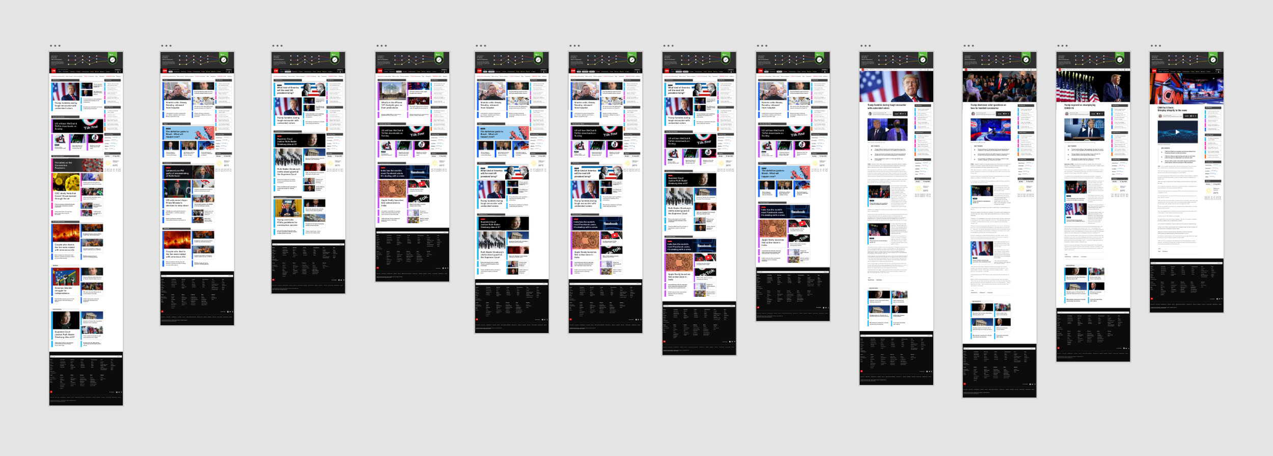
In my second hi-fi prototype, the homepage acts as a central dashboard. Content filters create a customised reading experience, using colour coding to help you recognise news categories. Related articles appear within clearly labelled containers, encouraging exploration. The visual hierarchy of the homepage allows you to consume news at glance.
The footer features certification from the International Fact-Checking Network, letting users know that the information presented to them has been independently verified and is news they can trust.
The story page presents important information upfront, with the video and key points, while giving the user the option to read on. Related articles appear throughout the story to encourage further reading.
Top Stories, Latest Stories, and Trending Tags appear on the sidebar which is present across both the homepage and story pages, to let the user know the important news stories for the day, no matter where they are on the website.
Click here to view the prototype.
Conclusion & Next Steps
This redesign of CNN’s desktop website presents a robust solution catering to the way Millennials share and consume content. This solution directly answers the user’s need for factual information, passive and active modes of consumption as well as providing relevant content.
The next steps would be to implement the features of Phase 2 & 3 into the design and to align it with accessibility guidelines, followed by usability testing to validate each stage.
*This was a self-directed personal project.


